Monday, June 13, 2011

The Hated Heat


I know most people who check out this blog probably don't like basketball. But that's ok because most people who do like basketball don't like these guys in this image either. When I was working on this I figured they would be the eventual champs. But that was before I realized that the aliens from Space Jam stole their super powers and gave them to Jason Terry. How else do you explain LeBron airballing layups and Wade dribbling it off his foot? Anyway, it was a really fun series to watch.

Tuesday, May 31, 2011

Dirk Nowitzki

The NBA finals start tonight, and I might actually watch this time since the Lakers aren't in it. And since Dirk and the Mavericks were the ones to dispatch the Lakers, I hope they win. Unfortunately, I don't think they will because as I was working on this portrait of Dirk, my wife said, "Oh, are you drawing Jon Heder?" And although that was probably just because of some drawing errors on my part, I realized that no one who could ever be mistaken for Napoleon Dynamite is going to beat LeBron and Wade.

Friday, May 06, 2011

From this morning's life drawing session


Done on the iPad, using the Brushes app, two hours. I like this one much better than my last few of attempts on the iPad. Painting on the iPad is fun, but it's a fight. I remember watching the documentary "It Might Get Loud" a while back and hearing guitarist Jack White talk about how he feels like playing his guitar should feel like a battle, and he's trying to conquer it. That's kind of what painting on the iPad feels like to me, and maybe that's why I haven't given up on it yet.

Wednesday, April 27, 2011

Clouds

Sometimes, just for practice, I will paint the clouds that I see outside my office window. I painted these yesterday, which was an exceptionally good day for clouds.

Thursday, March 10, 2011

Color Workshop with Bill Perkins

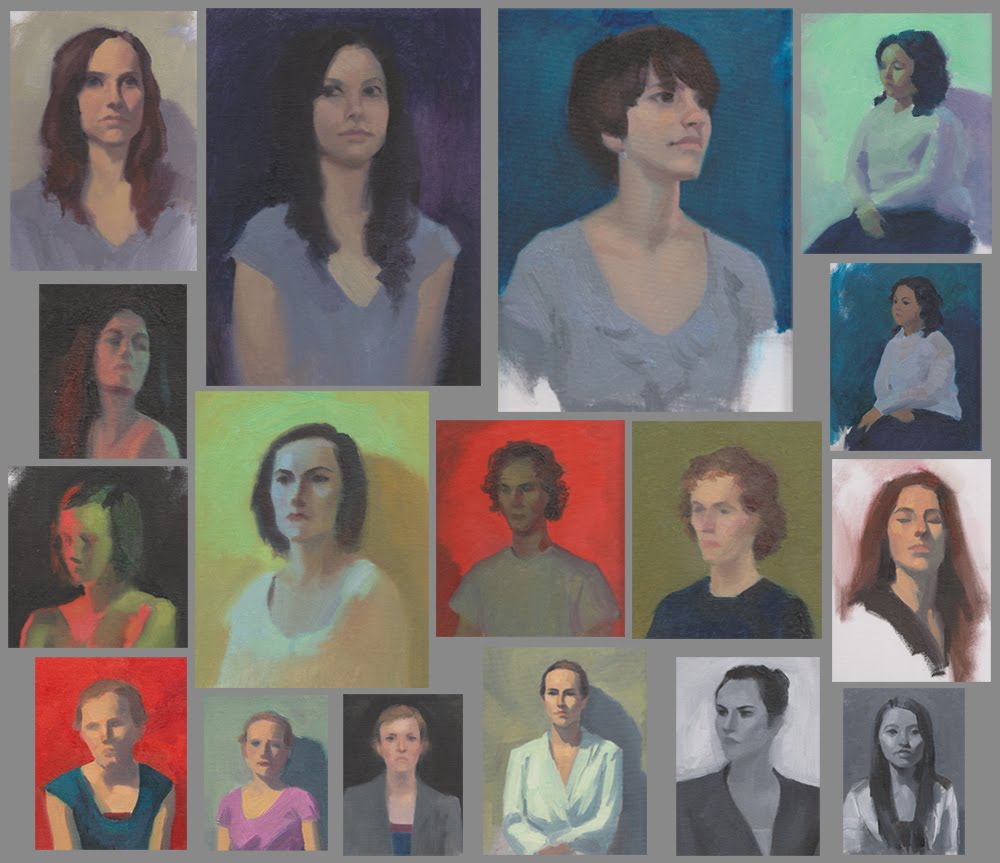
Last week I was able to go to a painting workshop with Bill Perkins. Bill is a very experienced artist who has done a lot of things. Check out his two websites here and here. He described this workshop as "color boot camp" designed to teach us as much about color and light as possible in just three days. He had us do many quick (30-45 min) paintings from the model under different lighting situations. I really enjoyed the colored lights, but the flat light situations were particularly challenging. It was a lot like doing plein air paintings, but of people rather than landscapes. He kept telling us not to worry about our drawing since there was no time for that, and so some of those sketches look pretty bad, but I thought I'd post them all up here anyway because I wanted to show the whole experience.
A lot of what we talked about was familiar, like starting with just values and talking about tonal contrast before moving on to saturation and hue contrasts, which is the way I teach digital painting. But there were some new ideas too, which really shouldn't have been new to me but somehow I managed to come this far without understanding them. Overall it was a great experience and I am excited to try out some of those new ideas in a painting when I can spend longer than 3o minutes on it.
And if you are interested in seeing what some other people did at the workshop Greg Newbold has blogged about it, and I thought Simini did a really nice job of capturing those colors.

Sunday, November 28, 2010

A few more landscape sketches

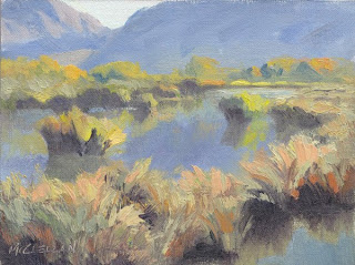
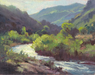
I kind of lost momentum with the iPad sketching, and went back to the real paints. Here are the three that I thought turned out the best from the last few months. I have had the pleasure of teaching some classes in the BYU illustration program this fall, and one of those classes was a landscape class where we went out plein air painting as a means of studying light and atmospheric perspective and then applied those principles to illustrations. I did the top image in that class. It must have been a nice spot because a lot of the students got a good sketch there too. Kind of surprising since it's Utah Lake...not known as a very picturesque spot. I have realized that I really like yellow and blue together. Almost as much as yellow-green and purple.

Wednesday, September 22, 2010

More Illustrations


These are some images that I did for the website for the book mentioned in the previous post, The Magnificent 12. I did a lot more, but these are the ones I like the best.

Sunday, August 29, 2010

The Magnificent 12


This is a book cover illustration that I did for a book that just hit the stores last week. It's a fantasy adventure story with a lot of humor in it, which is my kind of book. It's for pre-teens so it's probably about my reading level, too. I really enjoyed reading it with my kids.

I also did a lot of character spot illustations for the book's website: themag12.com. If you are nine or ten years old, or know someone that age, it's worth checking out.

Thursday, August 05, 2010

More iPad Paintings


The sunset one I painted last night out my back door. That effect with the red sunlight hitting the rain from behind was awesome, but lasted only about five minutes. So I tried to just get the colors and then did the rest from memory. It was done in Sketchbook Pro, but when I got it to the computer it looked too purple compared to what I remembered so I touched it up in Photoshop.

The other one was done near Memory Grove in Salt Lake City. I started that one in Brushes then switched to Sketchbook Pro because Sketchbook has a smudge tool for softening edges.